Driven by a deep love for nature

This case study explores the branding and visual strategy employed to capture the essence of tranquility and love for nature that defines Drzewostan.

Family hospitality business with mission

Drzewostan is an eco-friendly, family-run business located on the Polish coast, offering a unique experience of staying in tree houses nestled among the branches. This case study explores the branding and visual strategy employed to capture the essence of tranquility and love for nature that defines Drzewostan. The collaborative efforts of the team resulted in an elegant and natural identity that aligns with the client’s business goals.

logotype for travel and hospitality company
custom branding illustrations

Inspired by dreams

Driven by a deep love for nature, Asia and Krzysztof envisioned creating a serene sanctuary by the sea, inspired by their childhood dreams of magical hiding places. Drzewostan, their tree house retreat, aims to provide guests with a secluded getaway where they can immerse themselves in the beauty of the surroundings.
POS materials for tour operator

Minimal and modern design

The main objective of the branding strategy for Drzewostan was to reflect the tranquility and love for nature while maintaining a modern and minimal design aesthetic. The visual language needed to capture the unique differentiation of Drzewostan from other guest houses on the Polish coast, highlighting the focus on nature and providing a serene escape.

POS materials for tour operator

Logo design that surves the mission

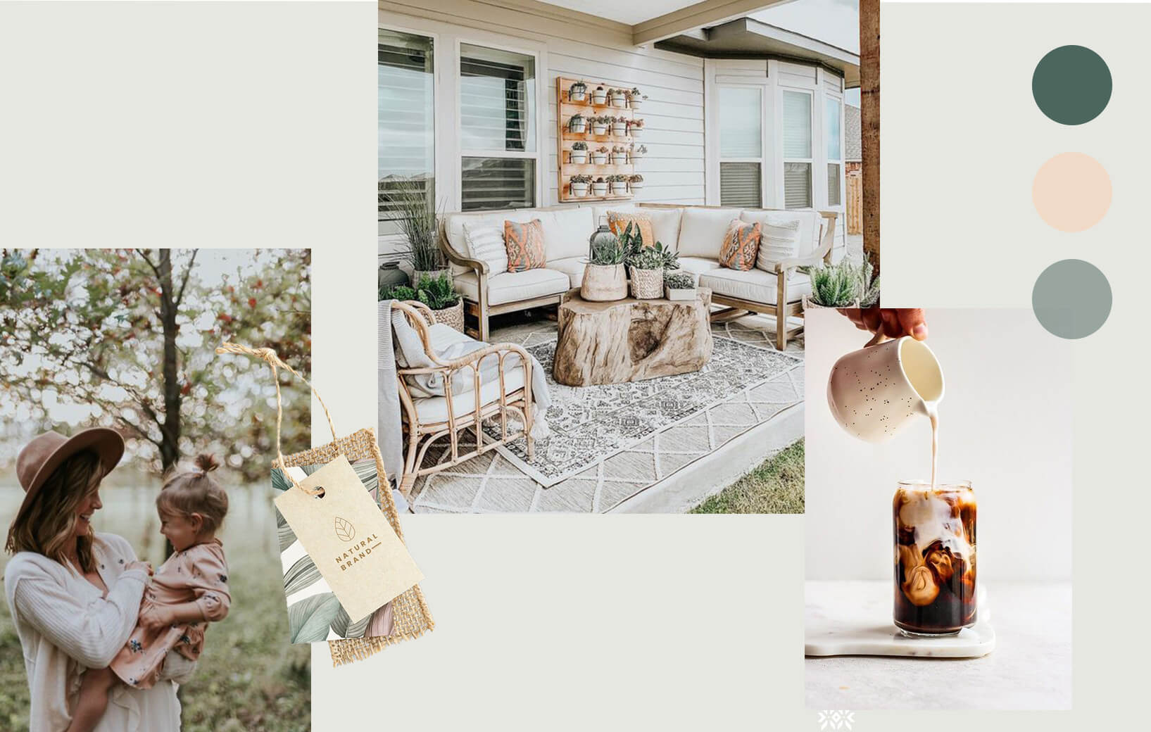
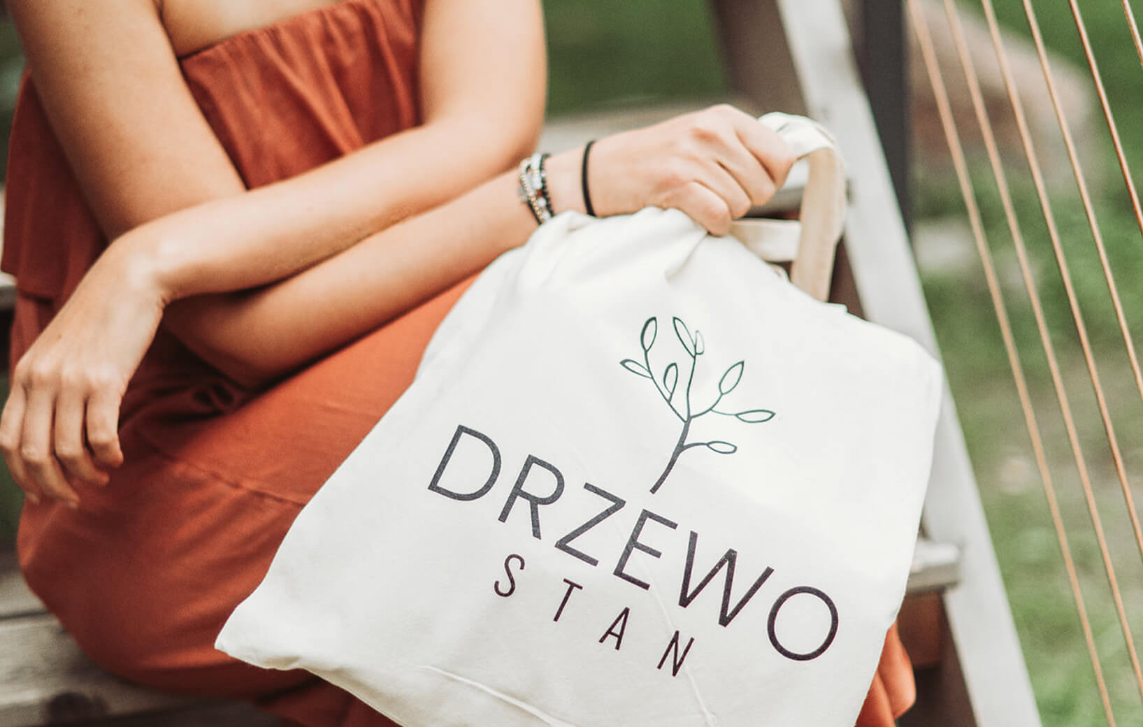
To differentiate Drzewostan, a minimalistic logo design was created to convey the essence of the place. The logo effectively represents the unique experience of staying in tree houses, emphasizing the harmony between nature and comfort. The visual design approach sought to create a sense of tranquility, using minimalistic elements and a nature-inspired color palette.
POS materials for tour operator

Capturing beauty of nature

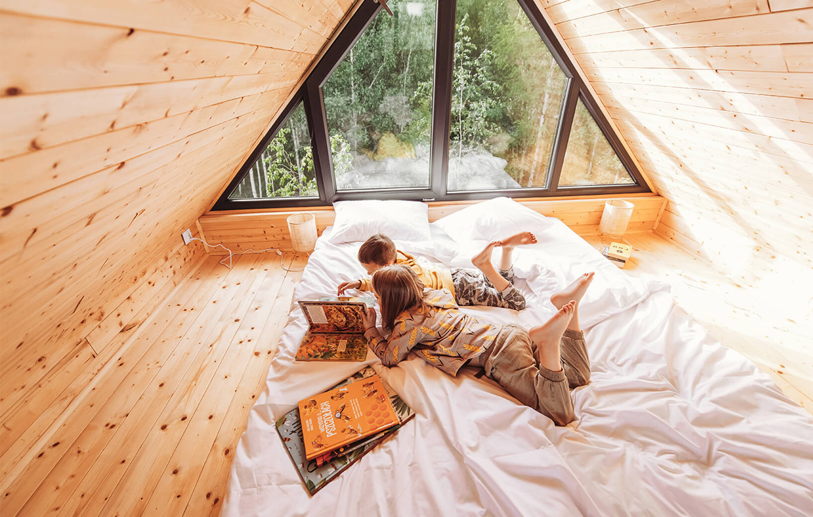
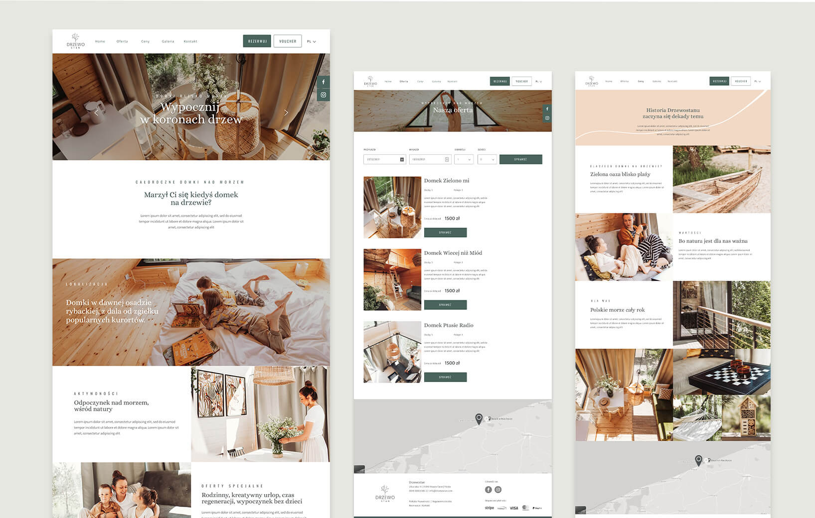
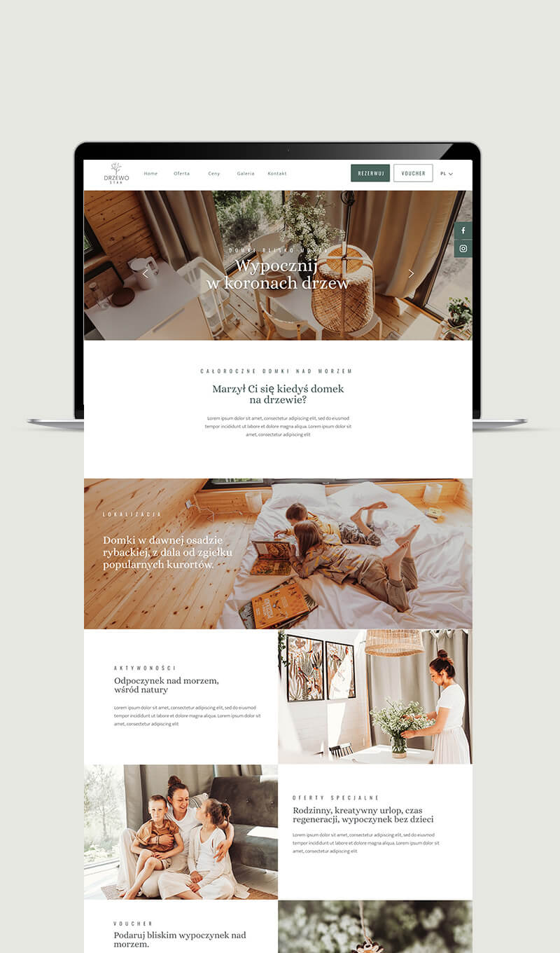
The website design played a crucial role in communicating the spirit of Drzewostan. Collaborating with Joanna Dorszyk, captivating photographs were taken, showcasing the natural beauty of the surroundings and the tree houses themselves. Additionally, Kasia Grzech provided imaginative and evocative copywriting, enhancing the website’s storytelling aspect. The website became a visual and textual representation of the serene retreat, evoking a sense of tranquility and inviting guests to immerse themselves in nature.
POS materials for tour operator

Collaborative efforts

 The minimalistic design and focus on nature resonated with the target audience, attracting guests seeking a serene escape immersed in nature. The collaborative efforts of the team created a cohesive and compelling brand experience that aligned with Drzewostan’s mission.
Holistic outcome

The collaborative efforts of the team resulted in an elegant and natural brand identity that effectively supports Drzewostan’s business goals. The visual language, characterized by a minimalistic design and nature-inspired elements, conveys tranquility and love for nature. The website, with its captivating visuals and engaging copywriting, provides a holistic representation of the retreat and its unique offerings.

Branding and strategy

Create an unforgettable experience for your guests