Re-branding with a mission
Ock Pop Tok (OPT), a social enterprise based in Lao PDR, embarked on a rebranding project with the aim of enhancing communication between the enterprise and its clients.


Creating equal opportunities for Women of Laos
Ock Pop Tok (OPT), a social enterprise based in Lao PDR, embarked on a rebranding project with the aim of enhancing communication between the enterprise and its clients. The primary objective was to effectively convey OPT’s story and highlight its social mission. This case study explores the challenges faced during the rebranding process and the successful outcome achieved through the collaboration between OPT and the branding expert, Magda.
All colors of Laos
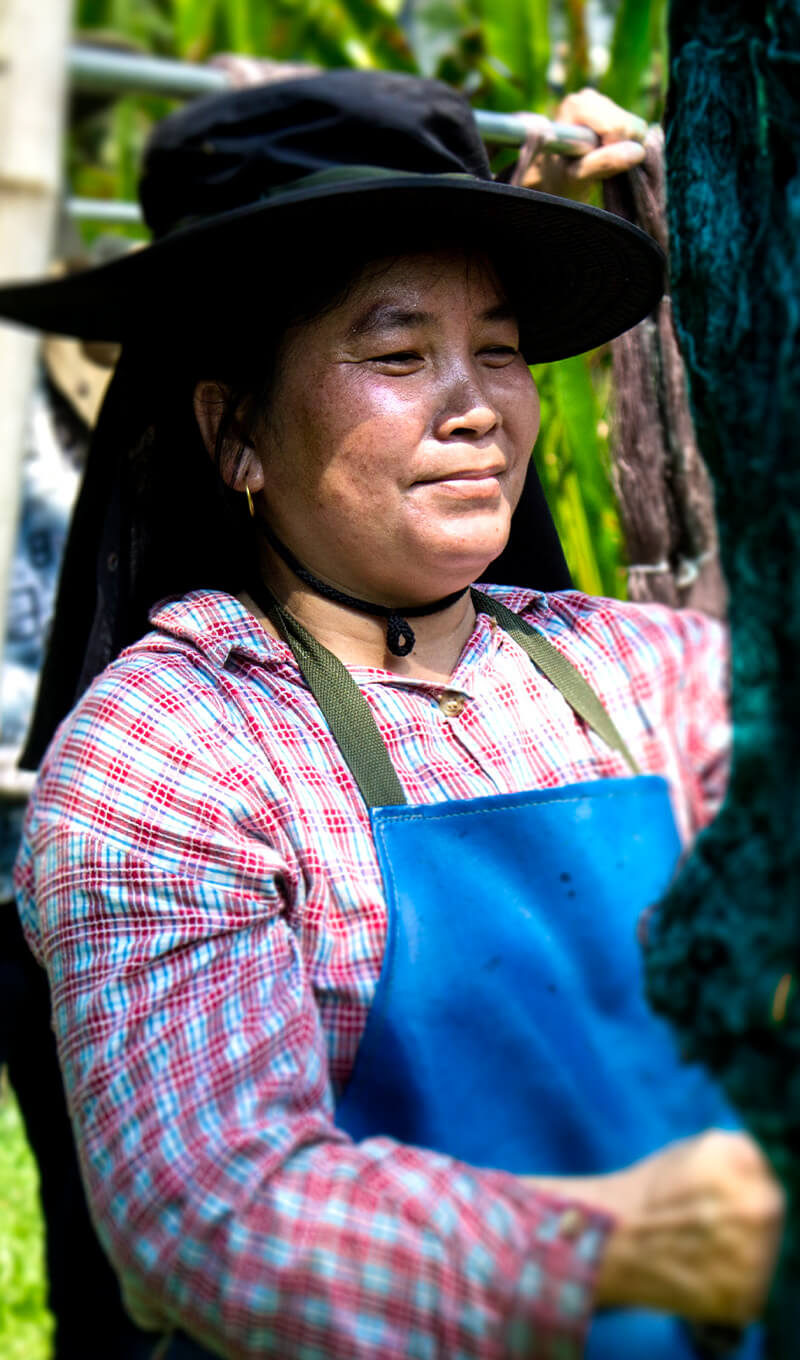
Ock Pop Tok is renowned for providing employment opportunities to women from local tribes, while simultaneously preserving their cultural heritage. With multiple business ventures, including stationery shops, room rentals, cafés, and workshops focused on traditional Lao crafts, OPT faced the challenge of unifying its diverse brands and three distinct locations under a cohesive identity. This rebranding project sought to create an umbrella brand that would be easily understood by tourists visiting Luang Prabang.
Understanding the complexity of the brand
The primary challenge was to establish a unified brand identity that would encompass OPT’s various business ventures and locations. The branding solution needed to reflect OPT’s commitment to cultural preservation and provide a visually cohesive experience for customers. The project required a deep understanding of the connections between the different elements and finding a common thread to tie them together.

Final brand design
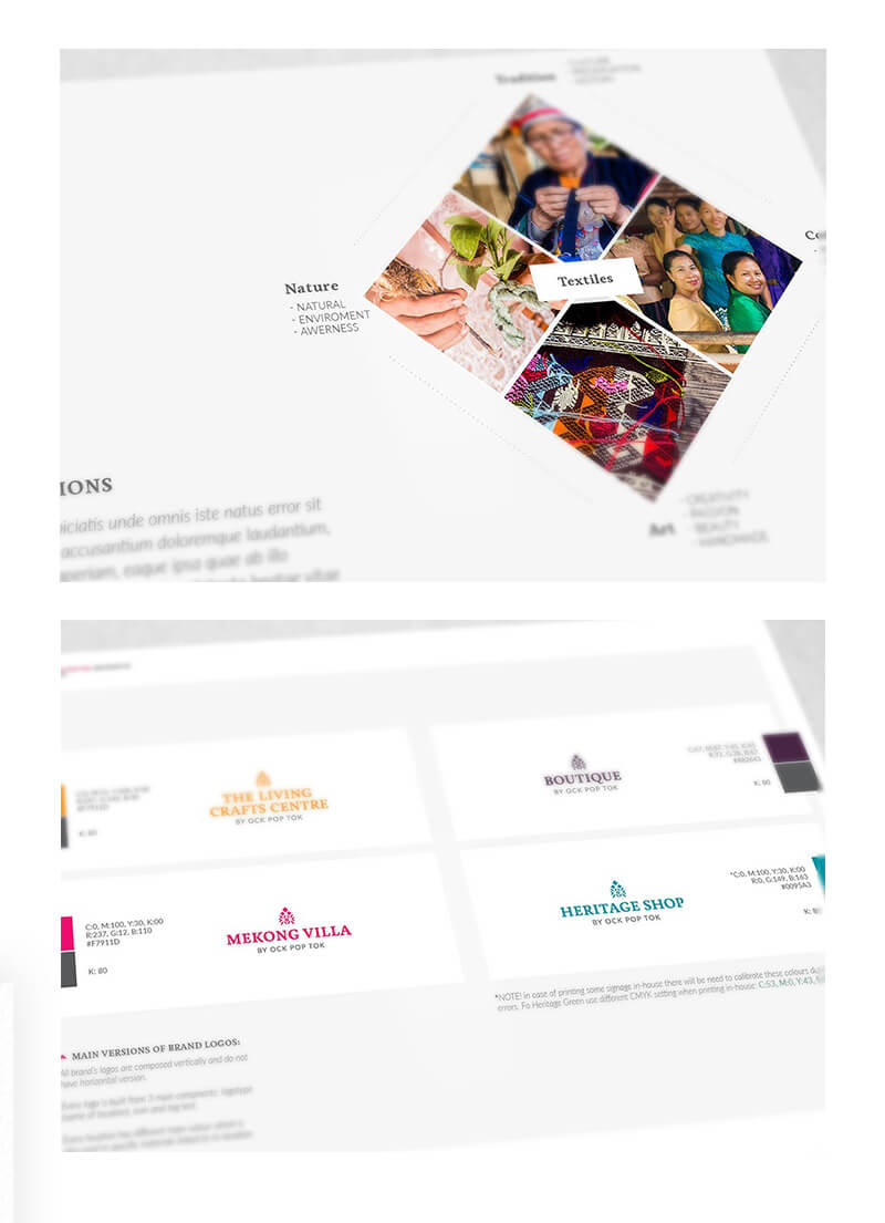
Working closely with OPT, Magda developed a rebranding strategy that captured the essence of the enterprise’s heritage and purpose. Inspired by natural dyes and handwoven fabrics, vivid hues were incorporated into the new branding to reflect OPT’s world. The design aimed for a modern yet rustic feel, with the logo drawing inspiration from traditional Lao motifs. Each location was assigned a unique color palette and supporting elements to maintain individuality while remaining connected to the overarching brand.
Cohesive umbrella brand
The new corporate identity revitalized OPT’s visual presence, giving the company a more professional and cohesive look. Moreover, the rebranding efforts helped organize OPT’s communication channels, making its mission more accessible and transparent to its audience. The comprehensive rollout of the new branding showcased its successful integration into every aspect of the enterprise.
Through the rebranding project, Ock Pop Tok successfully united its diverse brands and locations under one cohesive umbrella brand. The new branding not only provided OPT with a more professional and visually appealing look but also enhanced its communication efforts. By effectively telling the enterprise’s story and exposing its social mission, the rebranding project reinforced OPT’s commitment to cultural preservation and positioned it as a prominent social enterprise in Lao PDR.
Branding and Strategy
Create an unforgettable experience for your guests
NoOneWay Studio
Lisbon, Porto, Portugal
Blog
Privacy Policy
Contact
Copyright © 2024NoOneWay Studio. All Rights Reserved.

