Turning a Broken Flow Into a Better Booking Experience
How I transformed a frustrating, dead-end search experience into a guided recovery path, encouraging continued user exploration even when their original search results were unavailable.
Role & Collaboration
- Led the end-to-end design process, aligning the solution with multiple feature teams.
- Collaborated with a Solution Architect to address the cause of the errors.
- Ran alignment meetings with cross-functional teams.
Context
In travel products, availability is dynamic – itineraries can disappear in seconds. For users, this often leads to frustration, especially when they return to a trip they saved or viewed recently, only to find that it’s no longer accessible.
Many users of the product I was working on, were frequently met with a generic and unhelpful error screen, blocking their progress and breaking the core value proposition of the “save” feature.
Without analytics in place, I leaned on end-to-end usability studies and support insights, which consistently showed users encountering similar errors. This became our foundation for redesign.
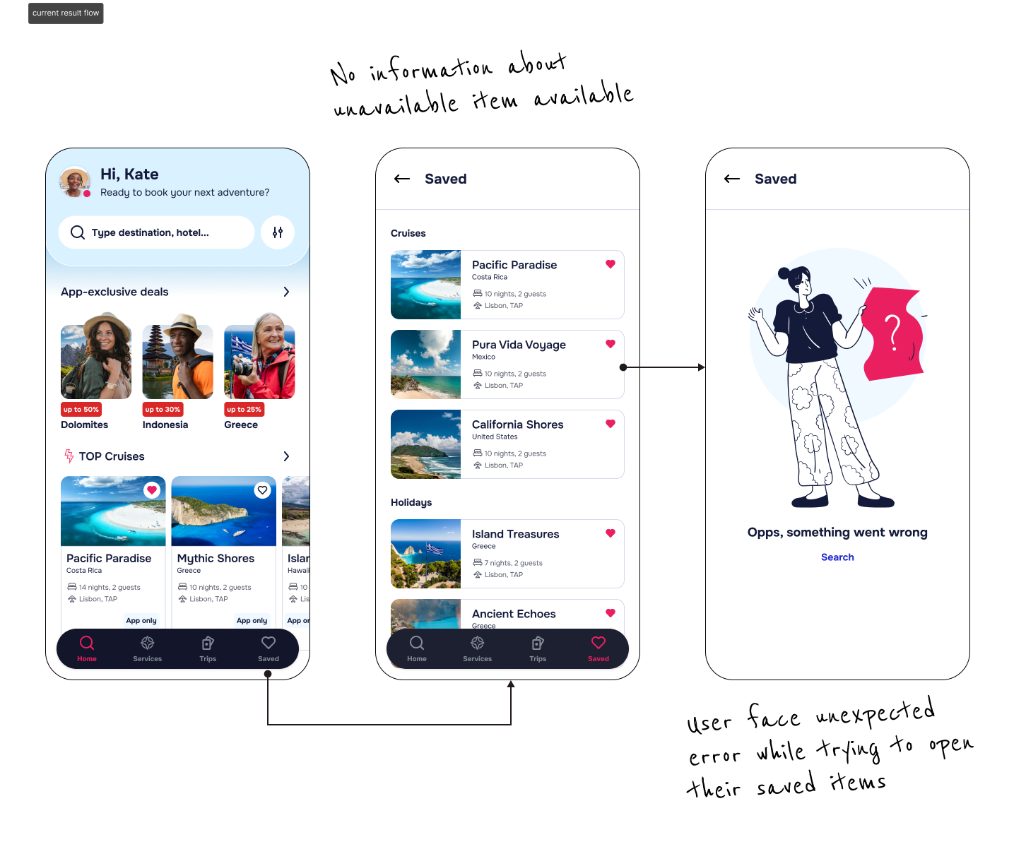
Pain points
-
Users encountered an error screen when trying to open saved items with no guidance or actionable steps, leaving them stranded and unsure what to do next.
-
Users couldn’t tell if their saved items were gone forever. This uncertainty directly eroded their trust in the product.
-
An initial investigation revealed that a backend technical limitation made it impossible to completely prevent all instances of this error in the short term.
Goal
- Design a more resilient and user-centric error-handling experience that could manage the issue when it occurred.
- Create a scalable solution that could be reused by other feature teams facing the same challenge.
- Decrease the percentage of users who abandon their session after encountering this error.
Discovery
First, I needed clarity on the error triggers and what prevented us from offering a smoother, real-time recovery. To get a better understanding, I worked closely with a Solution Architect who helped me map out all possible scenarios where this error is triggered and pinpoint their root cause.
It quickly became clear that, due to specific technical solutions and how the itineraries are built in the backend, we couldn’t fully prevent these edge cases. But we could reframe the experience that followed.
Rather than treating these moments as failure points, I saw them as opportunities to guide users forward in a more thoughtful way – transforming confusion into discovery.
Internal Insights
Since we aimed to create a scalable solution that could be reused across the app by other feature teams, I had to verify if they also struggled with the same issue and if the technical solution triggered the same limitations.
I quickly found out that not all of our product verticals struggled with the same technical issues, but all of them had implemented a common approach – to simply prompt users to repeat their search, causing them to face the same dead end. This showed me that this wasn’t a problem that had been closely investigated in the past, which created an opportunity to provide an even bigger impact on the user experience than we initially anticipated.
Benchmarking and ideation
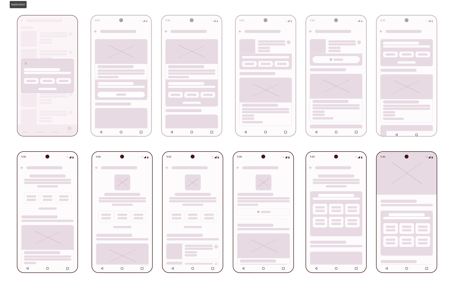
The next step was to look at how other travel and e-commerce platforms handled fallback states. After benchmarking 10 apps I could clearly see two main ways of handling these situations. This gave us a baseline to design improvements grounded in industry best practices.
One was to provide alternative dates on the detail page, which I already knew wasn’t feasible for us due to technical blockers and technical misalignment between different product verticals. Another approach was to provide prompts instead of an error page, which seemed like a natural choice that could unite all the verticals under one unified solution.
Design Process
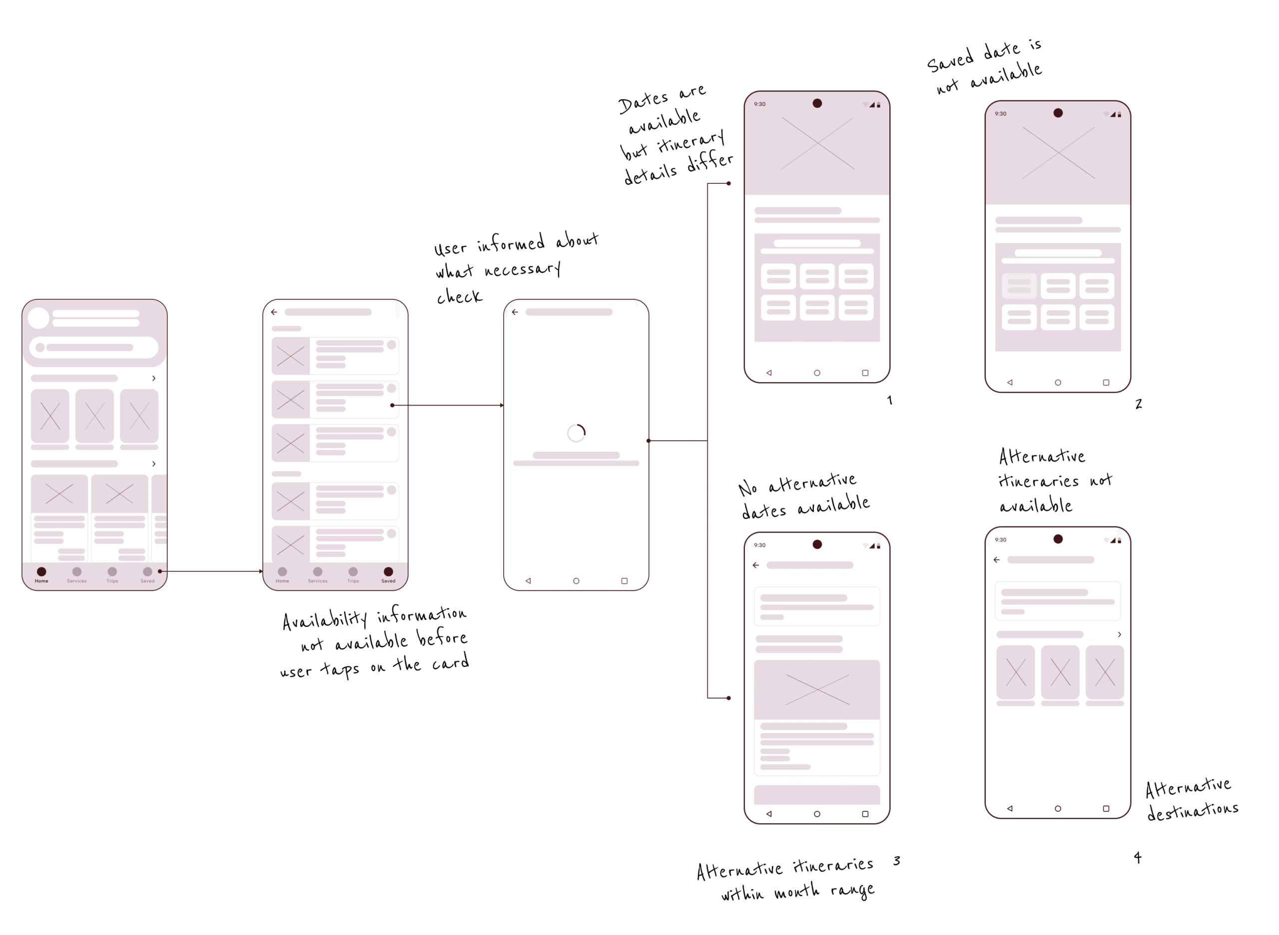
Keeping in mind scalability, technical limitations, and different scenarios provided by the Solution Architect, I mapped out flows that could cover not only the main user path but also edge cases.
Additionally, based on data, the fallback logic I designed prioritized what users value most – in the case of cruises, destination and dates.
Fallback scenarios
- The same itinerary and dates, but with a slightly modified offer (e.g., a different room type).
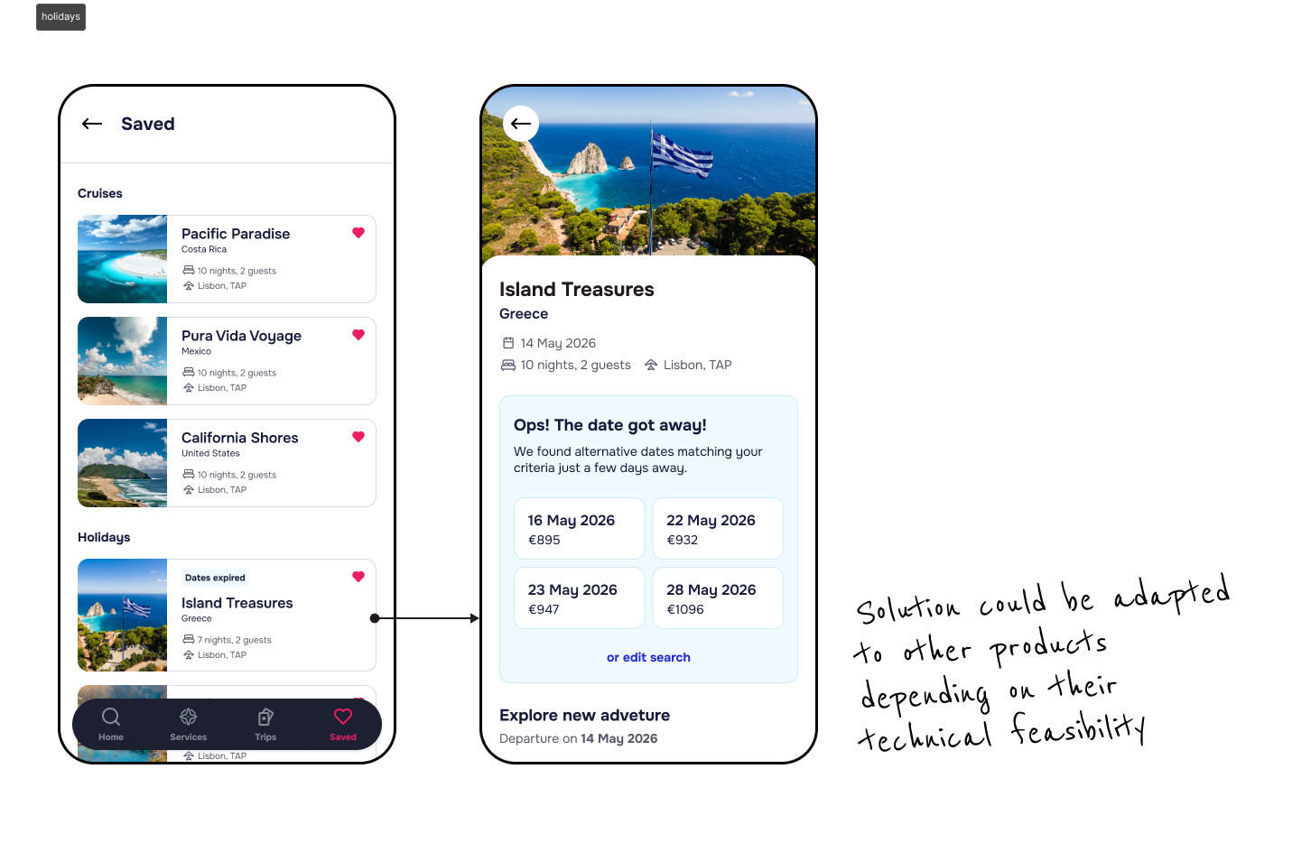
- The same itinerary, but available on nearby alternative dates.
- Similar itineraries in the same region within a three-month window.
- Similar trips in different regions that matched the user’s original date range.
Solution
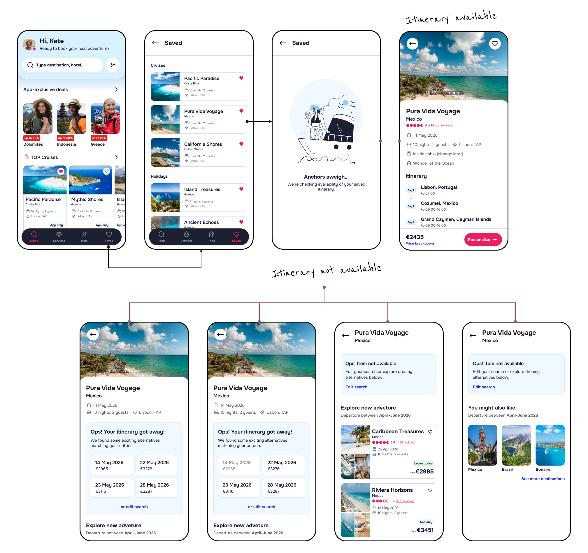
In the proposed solution, a user could jump straight into a new booking flow without being pushed back to the search panel. The context presented to the user included a reassurance section with itinerary data, a more descriptive message about the status of their saved item, and a dynamic alternatives module showing alternative dates or destinations.
I also adapted the tone of our messaging. This simple language shift reframed the situation from a dead end to a helpful recommendation. It set the stage for discovery, not disappointment.
Improvements
- Transparently inform the user that a problem has occurred.
- Offer simple, clear steps the user can take to try and resolve the issue themselves.
- Use data to prioritize the content that is most likely relevant to the user.
Aligning with broder team
A major strength of the new solution was its flexibility. The fallback logic and components were designed to scale across different product types and technical error scenarios. This created a reusable foundation that could be applied beyond this single issue, helping the product build broader resilience across the booking experience.
Therefore, I invited other feature teams to add their insights to make sure we covered their needs and answered the technical specifications.
Designing for the Unexpected
Designing for failure states can be just as impactful as designing for the happy path. By focusing on recovery – not just error – we were able to turn user frustration into continued engagement.
One of my recommendations was to implement analytics tracking to measure abandonment rate on this flow going forward, so we could validate impact with data. While not yet available, this setup positioned the team for stronger evidence-based iteration in the future.