Merging trip management experiences in one seamless app
How I supported the cruise product team in creating a seamless login and onboarding experience by identifying and optimizing a fragmented user journey to reduce friction for new and returning customers.
Role&Collaboration
- Led the end-to-end design process, aligning the UI and UX of the multiple products.
- Designed and executed a research plan, to uncover user needs.
- Conducted moderated user testing to validate design hypotheses.
- Translated research findings into actionable insights for stakeholders.
- Collaborated closely with the PO, CX Team, and another UX Designer to align on product strategy.
- Ensure technical feasibility and a smooth handoff process.
Context
Before I was asked to support a team responsible for optimizing app experience for cruise customers, the existing solution made managing travel plans feel like a juggling act.
To be able to book, manage, and handle their trip throughout the whole customer journey, they had to use three different web and mobile apps. This back-and-forth created inefficiencies, accessibility issues, and unnecessary hassle.
Pain points
- Switch between three different apps to manage different parts of their trip.
- Technical limitations resulting in difficulties accessing the travel details during the journey with limited internet acess.
- Complexity preventing older users from completing the necessary steps or even considering using the app in the first place.
Goal
To deliver a seamless experience to the users and bring everything into a single, user-friendly app with a consistent UI.
The project aimed to elevate experience, ensure a smooth journey at every step of the journey. To achive that I had to re-design the frontend and adapt mobile-first strategy.
Discovery
I kicked things off with in-depth desk research, analyzing existing documentation and past user studies. I also looked at competitor apps to see what worked well and compared those insights with our own app’s technical capabilities.
The Product Owner on the cruise team was an invaluable source of information about our users and customers. I also had the pleasure of talking with the CX team and research teams from other departments, who provided me with key insights throughout the project.

Design process
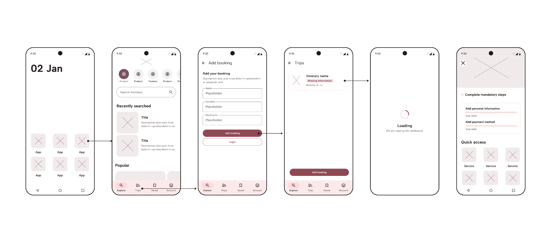
I began by conducting a comprehensive flow analysis, mapping the entire existing app to identify key user touchpoints and points of friction. My goal was to simplify the overall journey, ensuring users could access the most relevant information as quickly as possible.
Creating wireframes is integral part of the process and helps to quickly ideate and address potential pain points. The concepts were shared with wider team of designers to recive their feedback since many of them worked previously on similar feature that our solution had to align with.
In a key collaboration, I partnered with another UX designer to improve the cruise dashboard. We designed and implemented a checklist with progress indicators, a solution aimed at providing timely reminders for users who book their trips months in advance. Our core hypothesis was that this feature would boost user engagement, drive task completion, and ultimately reduce confusion.
Solution
Post-booking communication
In the purposed solution users who book their trip received an email with instructions about the next steps, ensuring they are aware of the mandatory actions.
Pre-trip experience
Users who are already logged into the app and/or have their booking added could access the trip dashboard through the same app they used to book their trip. They were also informed about any missing information that needed to be provided prior to departure.
During the trip
For users who had already embarked, connecting to the local Wi-Fi automatically opened the cruise dashboard and started the onboarding process, which must have been completed before departure.
Testing
To make sure I was on the right track, with collaboration with research team, I conducted moderated user testing with people who matched the target audience.
Objectives
-
Assess the ease of accessing the trip dashboard across different stages of the journey.
-
Evaluate the seamlessness of transitioning between different apps.
-
Measure the user’s understanding of the steps required to access the app and complete mandatory actions.
-
Gain insights into the timing and user behavior during the mandatory check-in process.

Outcomes
Testing brought key insights into the process and allowed me to further improve and simplify the flow. Overall, the core functionalities met expectations. The layout and structure were described as clear and useful, with some features – such as the pre-trip checklist and onboarding – seen as particularly supportive.
While initial engagement was strong, we learned that users preferred to complete certain steps closer to their trip date. This highlighted the need for timely reminders.
Therefore, I decided to simplify the pre-trip flow by removing intrusive bottom sheets. We kept the checklist and provided recommendations to the CX team for post-booking communication and timely notifications, ensuring users received helpful reminders without feeling pressured.

Pre-trip experience

Design Handoff
In this project, I proactively led design walkthroughs with developers where we discussed the designs and looked into potential challenges. One of which was covering accessibility.
As a company, we aimed to meet the accessibility AA standard by June 2025, and it was a priority that the designs were not only well-annotated but also correctly implemented. This partnership meant we caught and solved problems early.
One feel, one seamless experience
By merging three separate apps into one flow we aimed to provid a much-needed streamlined experience for travellers, significantly reduced friction, eliminating the need for multiple logins.